Update Information 🚀
- Enhanced User Page Design
- Fine-Tuned Various Designs
- Bug Fixes
- Performance Improvements
This time, we made visual updates to enhance the user experience!
Share Information Directly
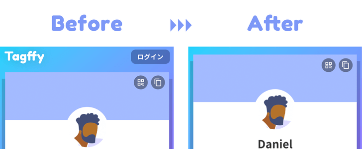
We removed the Tagffy logo area at the top to focus on share information directly. Login is now accessible from other pages, reinforcing the idea of “User Page = View Page”.
A cleaner look
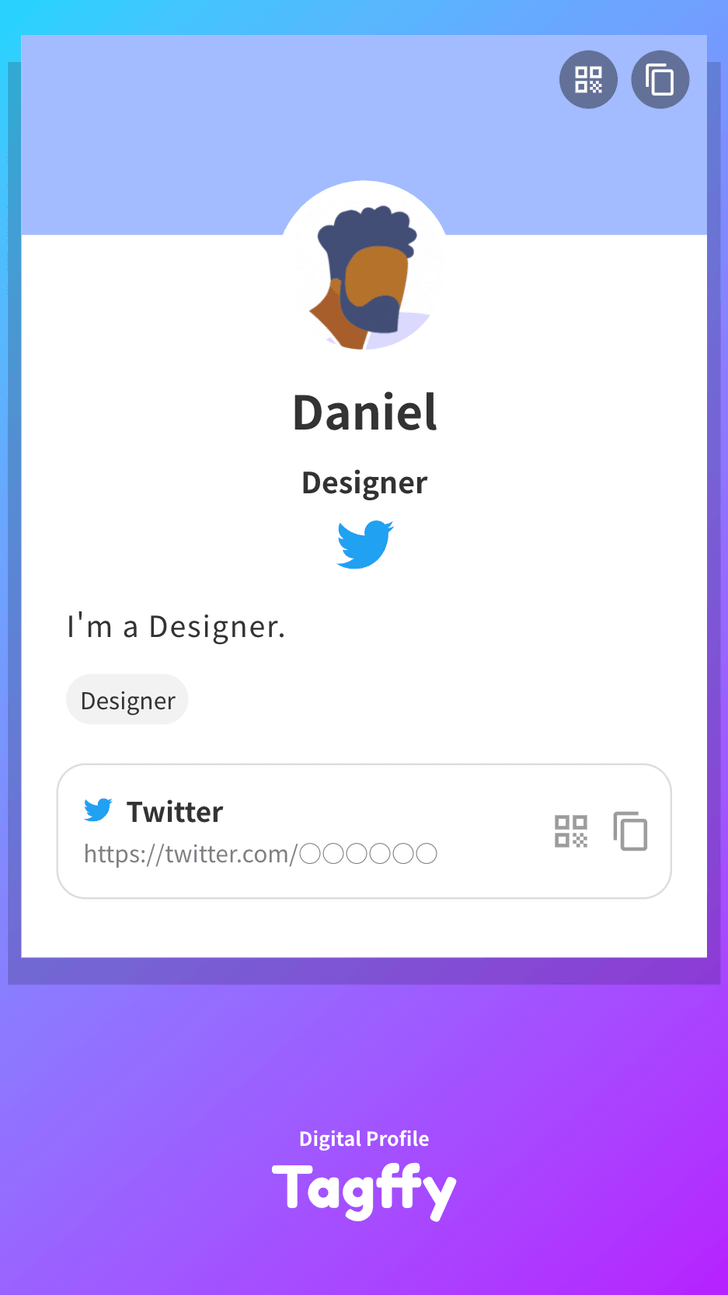
Following the ”User Page = View Page” concept, we simplified the bottom area with just the logo.
Overall appearance
Access Area Design
We also revisited the design of the access area, where page views and click counts are counted on the profile page, adjusting the font size for better readability.
New Access Area Design
Fine-Tuned Aesthetics
At Tagffy, we pay attention to even the smallest details. In this update, we made subtle design adjustments that might go unnoticed at first glance.
Bug Fixes and Performance Boost
This update includes bug fixes and performance improvements.
We will continue to work on improvements to make Tagffy more user-friendly, so thank you for your support!


